Are you in a urge to learn to fix that part of your LinkedIn where you SUCK, then you are at the place. I’m going to share with you, how professional LinkedIn banner helped me in winning Yeses from the clients.
Confused with the claim made?
*Story Time*
When I was new to the LinkedIn, I always thought that clients would also come to me, I would get a lot of work from them and cash would inflow! Life sorted!
Buuut… that didn’t turn out? Mirror of my life broke!
I began my hunt (can be due to jealousy) to answer the question,
Why 90% of the leads are generated by only 1% of the LinkedIn users?
What common trends are among the Pro LinkedIn users?
Answer – LinkedIn profile they built.
They work on the each and every element; the about section to the projects they accomplished, skills mentioning, and on the LinkedIn banner.
Amazed? Why the LinkedIn banner.
A short brief about my success with the this!
I owe my success to the LinkedIn profile banner I created. It has helped me in attracting leads (4 in total), when I just started, was having lesser than 700 connections on my LinkedIn profile. By that, I could generate a revenue of 16,500 INR ($217.602) in a single month from the comfort of my couch!
In this guide, I would teach you from A to Z of LinkedIn banner!
Starting off, perfect size for your professional background image. Then knowing “Why” of making the LinkedIn banner. And then we’ll see, How to create your LinkedIn banner.
Content Snap
What is a LinkedIn Profile banner?
You all must have noticed, a light blue color banner behind your profile picture.
Yes! That is your LinkedIn Profile banner.
You thought it is fine to keep it default?
Well, I’m sorry to break the bubble, it’s a BIG NO
Why to have a LinkedIn banner for your profile?
Suppose a reader (includes recruiter, your future client, your friend or a person who never see you before) stumbles to your profile. Imagine what he first checks out?
No Brainer!
- LinkedIn Profile Photograph
- LinkedIn Banner
- LinkedIn Credentials
Stunning First Impression
Your LinkedIn banner acquires the maximum space at the first look. Come on! you don’t have to be a maths wizard to understand this. A small 50-pixel profile dp (or headshot) and a 1728 pixel wide LinkedIn banner in the space.
Visual content matters. Human remembers the content presented on graphic 65% better than presented on plain text, says Adespresso.
Both for freelancer or job seeker, LinkedIn background banner gives you ONE MORE opportunity to brand yourself. To convince your client why they should HIRE you. And all this at your prospect one glance you are giving him.
Bottom Line – your LinkedIn banner makes it the most critical first impression to your future client.
You don’t need thousands of followers!
LinkedIn banner feature available for all to use, whether you are a premium member or a free LinkedIn user. Doesn’t matter, you have 100k following or just started.
It is an opportunity made for everyone to take advantage off. Everyone out here can upload a custom LinkedIn banner for FREE
And I’m here to tell you exactly the way you can leverage the use of a LinkedIn banner.
Let others know about You in less than 2 minutes
Rather than telling, I’ll simply demonstrate it!
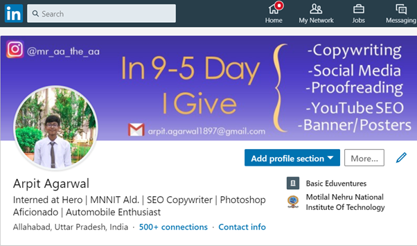
You see, who am I?
- Open for services
- Writes around social media post, Copywriting, and proofreading
- Do YouTube SEO
- Design graphics!
- Crunchy tagline
- Insta and mail ID to contact further
So much information in one design and also, my prospect would be assured that I write professionally not just outta hobby.
This would invite him, to spend more time on my profile and would be tempted to open the ABOUT section and send me a request to chat!
How to change the LinkedIn banner?
A 3-step process
- Go to the edit option on LinkedIn credential.
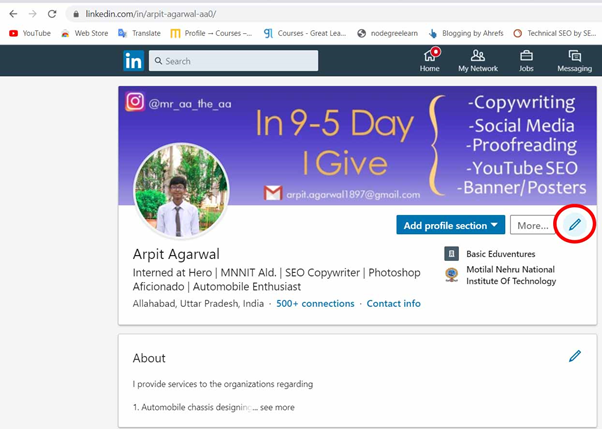
- Then check out the edit option on your banner!
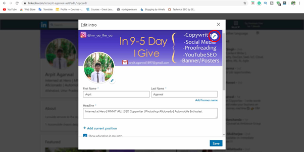
- Now a dialogue box, upload the file from your computer.
BOOM, LinkedIn banner gets updated.
What is the banner size for LinkedIn?
LinkedIn suggested for 1584*396 dimension (width*height) or 4:1.
Any design made bigger, would be cropped to bring it in the recommended dimension. So, be watch out!
Since, it is always advisable to use the maximum area allotted, it would be better to go for 1584*396 than 1200*400. As you have more area to play around with.
Caution – Size of the LinkedIn banner makes it tough for some to design.To HELP you with this, I’ve shared tricks and a step-by-step process to get you the banner like I have.
So, scroll further to know.
LinkedIn Banner Ideas
After analyzing thousands, literally thousands of profile. One thing I understood, LinkedIn Banner designing is far more different than designing a YouTube thumbnail
I’ve classified the LinkedIn banner style wrt 4 categories.
Reflecting your Brand Message
Many Pro users, use LinkedIn banner as an extra space to give a shoutout about their message. It can be a one liner or a self-written quote.
One thing, the message should be very relevant to your industry. And should resonate with your belief.
The purpose of that line should be, it emblems about your brand or your persona. It becomes a principle on which your business is driven by.

(img source – Dr. Aniruddha Malpani)
Simple, crisp message to the people who stumble at his profile to what he does. Anyone can get that, Dr. Malpani is an investor. The picture on the left, also complements the message… that giving financial support to the startups.
Quick Tip – How to know “what reflects your brand message”
Just look at your LinkedIn Title and self-analyze. Observe whether the text on banner is coherent (or speaking the same) to what is written in the Title.
If the answer is YES, then You ROCKED IT!
Who should use this –
LinkedIn coach, investor, and branding consultant.
Your work Life recorded in a snap
The co-operate folks, already working in 9-5 cubicle, should also use LinkedIn banner space. They can use it in showcasing their work-life. You standing upfront, giving a rocking presentation. Your friend clicked in between, giving you a perfect snap for your LinkedIn banner.
Always remember, “LinkedIn is about networking, it not always about job hunt or leads”. So, better your work profile looks, stronger your reputation would be in the industry.
For an entrepreneur, you can use the LinkedIn banner as an extension of your company.
This is what Gary Vaynerchuk has done

Also, if you are vlogger, it can be a great way to showcase your vlog snap to it. It would speak about your work profile and also the passion at the same end. Hitting two eggs from the single stone.
Who should use this –
vlogger, co-operate professional, yoga instructor, motivational speaker, and Entrepreneur.
Your services
If you are a freelancer on LinkedIn, searching for a client (like me) then this one is for you all guys.
In this, I advise you to showcase the services that you can bring for the client.
Now, in describing services you have two choices!
- Describe anything to everything!
- Describe only relevant services to your niche
Well, I choose the later one. It is just my personal choice.
Relevant services would be those areas you’ve worked in the past and you have considerable knowledge around it. In short, you can deliver the task around that confidently.
Though I can also write – An emailer, web analytics manager, white paper, pitch decks or blah blah… but I refrained!
Simple! 🙂
2 reasons, I decided to write only relevant ones
If the client approached me thinking I can deliver white paper which I may not, scenes can turn ugly. And every freelancer knows how bad the client review can dampen his image in the industry. Especially that industry which works more around the word of mouth.
Secondly, talking only relevant niches makes you the more authoritative to that domain. Everyone knows this, you can’t be an ace in all the trades. Hence the client may not approach you for this.
Bottom Line:
Freelancers’ sole purpose is to not upset the client.

(img source – Mohammad Musharraf, a freelance writer)
Testing this design, I can say why it is perfect
- Every service concealed in a box, makes design look cleaner and structured
- Bold and serious tag line
- Color consistency – A yellow strip line and Yellow text used
- Gradient Used
- Year written (2018, shows the experience of 2 years)
- Website to contact.
Also, you’d notice lots of similarities with my banner. (scroll down and find out)
Your achievements
Book authors use LinkedIn banner space in showcasing their book written by them. List down the numbers of views, ratings you get or anything you have in favor.
The achievements listing strategy (like, where you got featured) also works best for Growth Hackers or Site owners. This helps in marketing efforts and building trust.

(img source – Vaibhav Sisinty, a growth hacker)
This is a perfect example. LinkedIn profile banner it should look that you’ve a knack of earning and helping people with your services.
Vaibhav has shown:
- what he does
- website listed in the left
- achievements showcased, acting as testimonials he built in the industry
- delivering a speech, confident and dynamic he presents.
Tricks to make a better LinkedIn Banner
LinkedIn banner gets better on how well you insert elements.
With elements, I meant
- Color scheme used
- Text size, font used
- Plain or Gradient
- Images
- Shapes and geometric figures
- Icons
- Grid Placement
- Content
And, trust me there are a lot other principles, if I go on mentioning them. But that won’t be fruitful.
Cautionary Note – If you are not much good with designing, I firmly believe you should outsource work to a designer. You can get that as low as $5 on Fiverr
But Low on Budget, I have your back.
I’ll give you hacks so that without any prior designing knowledge you can create LinkedIn banner. I promise you, it would look fantastic.
Starting with
Color
- Preferably use a bright violet to bright blue to a darker shade of blue.
- Even shades of Pink – light pink, dark pink to violet also looks amazing.
My bet with light colors because they have a friendly appearance and that’s how I am. I’ve discussed further about color selection on custom thumbnail designing. Click to the color selection that way you would save your time.
Talking about color selection, See Vanshika has nailed it. A light pinkish gradient on background with rich purple color in the text. This makes her banner stands out!

- Don’t use colors – plain white/black or plain red. It looks pathetic
- Color of the title must be different from the color of text written
Text style
- Never go with Calibiri, Arial or Comic Sans. Pathetic fonts to say the least. Our human brain is tired of seeing them. Very boring fonts in all.
- For Title use – Montserrat font or Times Now Roman. For text use – Helvetica Neue or Century Gothlic or Franklin. You can get these fonts for FREE on font squirrel.
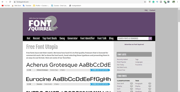
- Size of the title should never be smaller than the size of the text! (how would you feel if the heading is smaller than text, NOT A GOOD CHOICE!)
- The size difference between Title and text should be (Golden ratio in typography)
- Title – 21 pt
- Text – 14 pt
Plain or Gradient
- Gradient any day!
- Gradient looks more aesthetic and dynamically moving to our eye.
But.. They are tough to make! Hmm…
No problem hack to rescue!
Go to the Google images, type “latest gradients for banner”
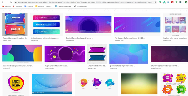
Save any gradient you like (please, do read the T&C of the image)
Also, stock sites also provide FREE gradients to use –
Freepik, my personal favorite!
On this site, type in “gradient background”
And in the filter panel – Make it License – FREE, Category – Photos and Sort by Popular
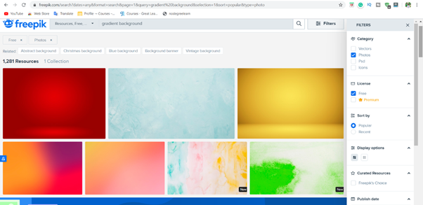
Freebie ALERT – Sign up! And get two amazing professional LinkedIn banner background. Just Sign up – to claim IT on your email account.
Images
- No fix rule but advisable that only those professional should use image who having their brand or organization. They can use images to reflect the message of their brand.
- Makeuseof has made a complete list of what images to use for creating LinkedIn banner. You definitely read that article.
- One good thing with images, it makes the designing easier.
- If you’ve a self-made logo, consider adding that!
Regarding aesthetics don’t push your design too hard.
Don’t fill everything in it. If you think, no need for picture then avoid it! Clients can read!
In my design, I didn’t add any because it was not needed.
Shapes and Geometric Figures
Have you ever drawn flow chart in your notes? Imagined why it is so easy to remember via flow chart?
The answer lies it is very structured. It makes it easier for all of us to remember the content.
Similar effect are brought by shapes and geometric figures.
The shapes can include an arrow, curly brackets (like I used) or even a simple box shape rectangle.
Icons
- I love icons. We can get so much information from only one icon
- Also, it attracts our vision
- Best method to share your contact with your client
- You can get icons for FREE either from Freepik or from Vecteezy.
Go to the Vecteezy site, Type “Instagram logo” then choose vectors in the search,
Then I want you to tick mark “FREE in the License” and sort by “Best”.
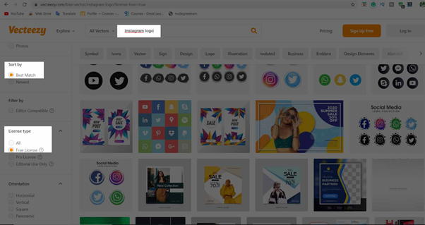
This technique works awsomely well for other logos like Facebook, Snap Chat, etc.
Grid Placement
Well, we love to fill the space to what we want to show!
But wait, Do you think is it Okayyy to mess up the good work just because of the improper location?
Of course NOT
And trust me, these mistakes happen! A lot!
Time to give tips 😊
- You cannot use, the portion which is behind your headshot! You know this, just remember it when applying
- Keep your icons and text in-lined
- All you in-text should be below your headline. Else, your headline has no meaning.
Content
- Should be small but crisp. Like My 9-5 day summarises what I do daily.
- Text should be such it speaks the same like your LinkedIn credential do.
In my case, I am a copywriter and designer.
My Profile says “SEO Copywriter | Photoshop Aficionado”. And exactly this is what I included on my banner “Copywriting (at the top) and Designing Posters (at the bottom)”.
Pro Tip –
- Always drop your contact, preferably email ID, on the banner. It makes it easier for the client to reach out You.
- It is a good idea to cross-promote your platform. Like I’ve promoted my Instagram page by sharing my handle.

Sites to create (design) LinkedIn banner for FREE
Though, the best approach would be to hire a designer who uses Photoshop and can design the banner for you.
Still, it is not a bad idea to DIY the task.
There are 3 BEST sites where you can design the LinkedIn banner for FREE
It is a new platform specifically dedicated to design professional backgrounds for your LinkedIn profile.
Anne Pryor nailed it in describing how she creates LinkedIn banner with fotor.
She explained that LinkedIn background must contain 3 photograph, and such that the photographs align well. Most importantly, the photographs reflects your persona or profession.
- Second one, my personal favorite, is Canva
With Canva, you get a variety to templates to choose from it.
Also, over fotor, there is one more advantage. You get large variety of Fonts and Colors to design your LinkedIn background cover on Canva.
It is the best site to collect the stock images for free without worrying about the licensing.
Also, the images are well grouped wrt the categories makes it easier for the user to search around.
You can use these images in making you LinkedIn banner.
Apps to create LinkedIn banner on Mobile for FREE
Trust me it is alot easier to make a banner from mobile than from your desktop.
Apps I use,
Because the color and gradients it provides in the banner.
Also, the images come copyright free.
This is a very simple but effective app to create LinkedIn banner.
You can get a wide variety of the colored images which are grouped with the categories.
Also, it has filters like Hue and Saturation. This can improve the color intensity of the LinkedIn background photo and hence would improve the appearance.
Also, like Canva it has huge font library installed to use.
I would recommend you to watch a YouTube video before start preparing. By this way, you can have a better idea with the functionalities of the app.
Takeaways
We’ve discovered how important the LinkedIn banner is. It gives you an opportunity to brand yourself again, and better.
Also, we look around that what things you should know before designing the LinkedIn banner.
At the end, I gave you platforms and applications from where you can design the banner for free.



2 Comments
arpit.agarwal1897@gmail.com · May 5, 2020 at 4:47 am
Anyone, want’s to put any questions Let me know. Always remember, I’m one click away.
May be sitting far but connected with you! That’s Power of Internet
Kaushik Kannan · August 29, 2020 at 9:42 pm
Agree, 100%! 🔥
Your LinkedIn banner is one of the first things people see. LinkedIn being a platform filled with so many potential collaborations and some incredibly interesting people, you definitely want to catch their eye!
Love the points you’ve covered Arpit!
Definitely make it simply for them to understand what you so and steal the spotlight while you’re at it! 💯