.
Problem with other weight loss Facebook guides (like any other guide) – just sharing Best Practices which may not work. 🙁
Also, the caveat varies significantly for different audiences.
But one thing remains the same, It’s the Psychology: Behavioral science towards making the purchase. Insights on what specific psychology the brand campaign used to bring conversions.
Adding up, it’s a critique. I walk you through, areas they did right… so, you can copy. And places they went wrong, so you can avoid for your campaign.
Let’s start with guidelines for writing the weight loss ads. Then jumping to the examples.
Content Snap
Anatomy of a Weight Loss Facebook Ad Image
.

.
Note – You can cross the character limit, but then text would appear truncated. So, I advise you to keep Link Heading & Description within the limits.
PS – Terminology used in the Ad would be consistent throughout the blog post 😊
.
Characteristics of a Good Weight Loss Facebook Copy
- Less text yet conveys lots. Because attention span for Facebook Ads is only 8.25 seconds.
- Communicates the USP clearly (USP piques the curiosity)
- Tailored to a specific audience
- In-sync with the brand’s voice
- Passes the Scroll Test – Something unique that makes the Ad stands out.
- Strong CTA = Give reasons that compel readers to click on it.
.
Fair Suggestion – Take these points as a guideline, not a rule.
.
Facebook Ads Funnel
Series of Ad campaigns to establish relations with the users in an organized fashion, making them into paid customers.
Type 1
| Funnel Stage | CTA Used |
| Brand Awareness | Learn More, Sign up |
| Acquisition (Lead Magnet) | Download |
| Transactional (Sale) | Show Now, Get Tickets |
Type 2
| Funnel Stage | Purpose |
| Brand Awareness (No sale) | Get in front of the audience. |
| Selling via Testimonials | Establish trust and authority |
| Flash Sale | Leverage FOMO |
.
PRO Tip – Follow these Companies on Facebook, frequently publishes Ads. Hence, would keep your creativity flowing.
.
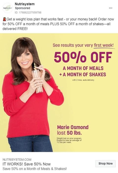
Nutrisystem
.
.
What I love
1. Creating an irresistible offer.
Quick results + Money-Back + Flash Discount + Freebies + Free delivery. Woof!
This is an old trick to bring results. Make your offer sooooo good, it gets hard for readers to deny.
2. Kick-Ass Hook
“Get a weight loss plan that works fast – your money back!”
Solving the problem, addressing you’d find it quick. And a risk-free solution.
Copywriting Principle used: start line with an Action verb (Get). Makes it impactful and compels a person to read.
3. Right CTA
Easy it may look, but many marketers get this wrong. Proof? Scroll further, you’ll get that. 😂
.
What could be better
1. Overusing 50%.
It gets a bit over-the-top.
2. In their Headline “It works”
Better would be ‘Results in 1 Week. Save 50%’. Quantify the expectations.
3. Could be better with Social Proof
Marie Oswald lost 50 lbs. in 6 weeks.
4. Vague Ad Colors
Too many colors on the Ad. Also, they didn’t use their brand color (that’s light green – color of the logo).
Colors play a vital role in branding, be it Facebook Ad, LinkedIn banner design, or Website’s Theme… should reflect your brand colors.
.
Orgain
.
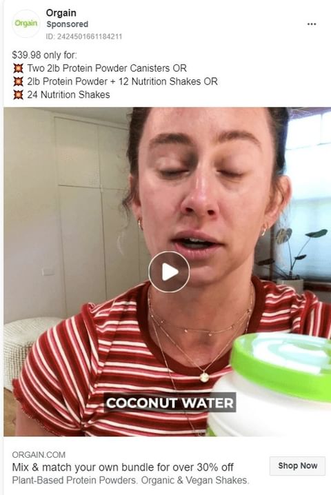
Side Note – As you see, Orgain’s Protein Shake is priced @ $1.66/bottle (economical). Hence, they arched the price-sensitive audience. That’s why they didn’t focus on the product’s USP.
.
What I Love
1. Using magical number 9
We’ve seen this countless times, e-commerce store pricing it like 499 or 999 or 39. Done to make the price lower.
But is it effective?
Yes!
Experiment by MIT & Univ. of Chicago where they listed the price $34, $39, and $44. Despite $34 being the cheapest, $39 performed the best!
Hence, there’s some magic. Must include in your pricing strategy.
2. Link Description
Plant-Based & Vegan, both stuff people are asking for. And they vividly answered it.
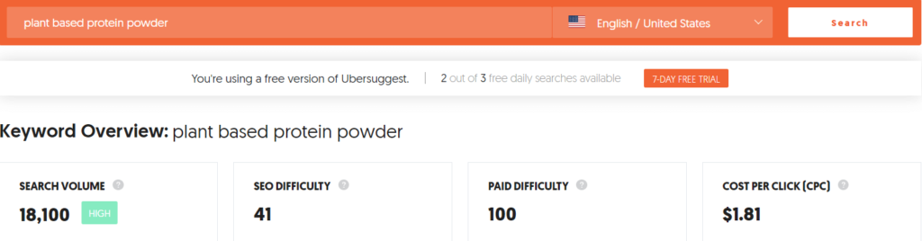
Copywriting Tip – If you want to do audience research
Tool – Ubersuggest
Like in this case, Plant-based Protein Powder (long-tail keyword) And it brings 18,100 searches/mo from the USA alone.
.
What they could improve
1. Video Thumbnail
Needs serious improvement. Although Facebook does run videos automatically, still every 1% counts.
If anyone from Orgain is reading, go through my YouTube thumbnail guide.
.
Quest Nutrition

.
What I love
1. Creating a sense of community
“Join the #QUESTSSQUAD!”
This taps into the customer’s mind, the product is used earlier and they reaped benefits from it. This is called in-group bias or Bandwagon Effect.
The effect says, a member would act accordingly other members in the group (e.g., countrymen). But theory holds true for the arbitrary groups (like dog lovers or StarWars fans) too. Cool, Eh!
2. Double CTA
One in the post & one in the Link description.
This works best when you’re offering something free like: Lead Magnets or Email Signups.
3. Emojis to make it scannable
A popular technique to list down benefits.
4. Resonating image
Loved it. Clearly showing customers enjoying the product. And designing a collage looks a good idea.
Also, they used a Psychology trick: spreading positive vibe. People rely on emotions than notions when making a decision. Hence, associating a brand with positive emotions, coerces customers to make the purchase.
Moreover, the expressions you leave with your content, likewise expressions people will develop.
.
What could be better
1. A mismatch between CTAs
They said ‘sign up’ in the text while ‘learn more’ in the CTA.
That’s very wrong!
Link CTA should change to ‘Sign Up’.
2. Link Headline is 1/10
Better version — “Sign Up to Quest Quad, it’s Free”
Copywriting Trick
Sign up for FREE Master Class. 🙅
Sign Up for Master Class, it’s Free. 👨🏻🏫
The former shows desperation for the conversion. And indicating, people would sign up for the offer because it’s free… hence, disrespecting the consumer’s time.
Later one… Free acts as an objection removal. Therefore, boosting the conversions.
3. Link Description is 2/10
It’s repetitive.
Better — Join the [X] community of healthy moms and dad.
Why it’s better
- Adding a number increases the CTR, says Moz.
- You’re giving a social proof… that [X] members have already joined it.
- Calling out the audience. This draws attention. Further, attracts the targeted ones.
Calling out audience further reinforces, why it’s important to have a buyer’s persona. So, we can optimize for the search intent.
This is the technique, I learned lately.
Once acquitted, applied immediately on my home page. 😁
.
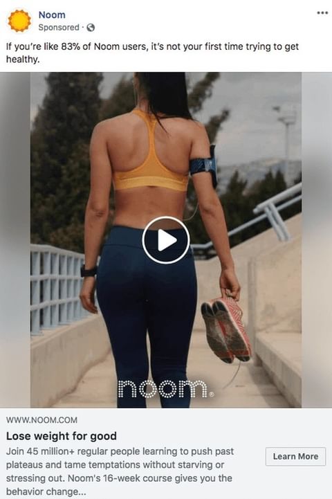
Noom
.
What I Love
1. Using the Negative Headline
A closer look would tell they purposely curated a negative headline (used NOT).
Why?
Our brain notices negative incident and likely to remember it. In Psychology, this behavior is called negative bias.
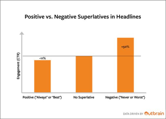
Adding up, Outbrain did an industry study on 65,000 headlines… found negative headlines have 63% better CTR than positive ones.
Brownie Points – Noom leveraging the audience’s feedback. And using the exact figures.
2. Link Headline
Efficiently telling the Noom’s USP
3. Smartly kept the visual-consistency
Consistent Brand Appearance In thumbnail – an adorable-fit lady, ready to jog on her skinny jeggings… wearing a sports bra of Noom colors.
What could be better
1. Link Description – Verbose
Better version:
‘Join 45+ Million folks pushing the past plateaus and tame temptations without starving via 16-Week Noom’s program.’
.
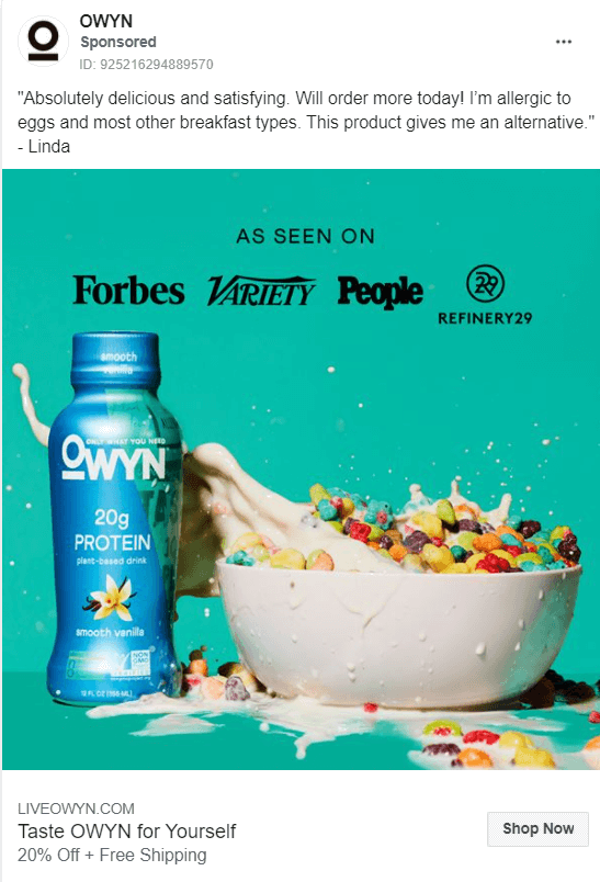
OWYN
.
What I Love
1. Social Proof Psychology
“Good social proof is useful for all the landing pages. Because people trust people more than they trust the marketers.”
By Joanna Wiebe at CXL
Since, OWYN is for upper-strata society… hence, saying, “healthy and cut weight quickly” scheme will not work.
Associating with org. like Forbes & People helps them in justifying their price.
Adding up, ‘Absolutely’ or ‘will order more today!’… looks like the review is unfiltered. And it’s a good thing; Increases trustability.
2. Contrasting Image
Whosoever has done the brand packaging, nailed it!
Refreshing colors.
Protein shake inside the cereal bowl — showing the product use.
Logo color is used in writing the text, hence maintaining the visual harmony.
3. Talked about Allergies
In the supplement industry, allergy is one major repulsion from trying a new product. Glad the company incorporated that.
.
What they could have done better
1. Not Geo-targeting
OWYN is not available everywhere. So, geo-targeting was needed but not reflected in the Ad.
How to implement?
– Linda, a school teacher, California.
Just a Little tweak in the testimonial.
Also, Facebook won’t flag it because you’re just sharing the identity of an individual (making it a more transparent review 😉).
2. Link Description
It’s crisp, but not objection removing.
Because:
A) “Save 20%” > “20% off”
Save word taps into the mindset that you’re spending less. While 20% off sounds kinda 20% discount, meaning consumer would buy because they’re getting a discount.
B) Free Shipping 🙅🏻♂️
Free Shipping in California 👨🏻🏫
.
Soylent
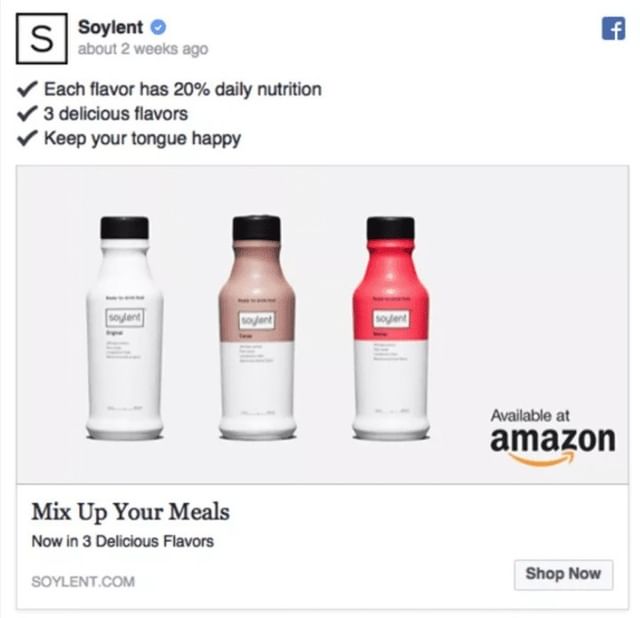
.
What I Love
1. Minimalistic
No text. Just the product, a drop shadow, and a Amazon logo as a shipping partner.
It’s the prime reason, Soylent Fb Ad made into this list.
2. Emoji to list benefits
As explained above, emojis helps users to scan the text.
3. Used White Background & Amazon Logo
Okay, just I said contrasting & colorful… and now white background?
Hear me out, marketer!
Karola Karlson, Facebook Ads expert, suggests experimenting with white background. Since, white having its unique identity stands out, therefore increasing the CTR.
Shop at Amazon – definitely helped their conversions.
How?
89% Of consumers prefer Amazon to buy products than other e-commerce sites. This inclination is due to Ambiguity Bias = selecting the option we tried before and got satisfactory results.
Note – The same principle that makes clients to spend on those freelancers whom they hire before.
4. Link Heading
Perfectly explaining the USP (Unique Selling Point).
Because 20% nutrition is not enough to skip meal, but good enough for your afternoon munching. That’s why “mix up your meals”. 🙂
What could be better
Rugged edges in the list – leaves a bad impression.
Solution – Style it!
Better version:
✔20% daily nutrition for healthy tommy
✔Coming in 3 All-time favorite flavors
✔To keep your tongue happy
.
Vida Health
.
What I Love
1. Psychology used – reciprocity.
“No society on Earth escapes the reciprocity principle.”
By Sociologist Alvin Gouldner
The law is simple. Arpit, a content creator, helps a guy Bob in solving the problem. Now, Bob B is in debt, eventually paybacks to Arpit 😁
This is the same rule that SM content creation and Blogging works.
Inside the video, people are benefited from the value… making them more likely to avail the personalized services.
2. Repeating the CTA
At the end of the video & in the Link Headline.
Adding up, CTA starts with an action verb “Get”. Hence, pushes the audience to take action.
3. Cinematography
A) First the thumbnail is in sync with brand colors and describing the benefits.
B) No Talking, only showing. Making it easier for the audience to consume.
What could be better
1. First line is verbose.
Original – “Smart food swaps can help you eat better and loose weight“
Rephrase it – ‘Smart food swaps to eat better and loose weight naturally‘.
Note – Verbose makes the sentence weaker.
.
2. Missing Link Description
Some may argue that ad suffices and doesn’t require more info to stuff…
I get it, but a simple line “Tap to Learn More” works wonder. And in conversion marketing, every click counts.
.
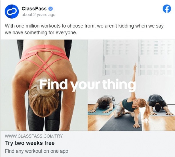
ClassPass
.
What I Love
1. A classic example of Features -> Benefits conversion.
You see, nobody gives a damn about 1 Million Exercises. So, they penned it as “we have something for everyone“. Hence, shifting gears from product-centric to customer-centric subtly.
PRO Tip – If you too wanna replicate… easiest way, while copyediting read a line and ask yourself “so what”. This would help you in scrutinizing every line, helping you reach the marketing goals.
2. Vibrant Visuals
Showing their product in use works. With a Punchy line (known as Text Overlay) to hook the audience.
More on the text overlay, so scroll further.
3. Link Heading & Description
Scannable and Placement.
In the heading they shared, product has a free trial (two week free). And then explained where they can avail it (app).
.
What could be better
1. Inconsistent Brand visuals
Brand color is darker tones of blue, but not reflecting the same in the image. Could’ve done what Noom did, wore a sports bra of the same branding colors.
2. No CTA
I admit it’s a brand awareness Fb ad; implying made to just get in front of targeted customers. But still, having a softer CTA like “Learn More” hikes conversions dramatically.
CTA importance can be measured by
“Every persuasive writing has a Call-to-action button.”
By Simone, Co-Founder at Copyblogger Media.
.
HelloFresh
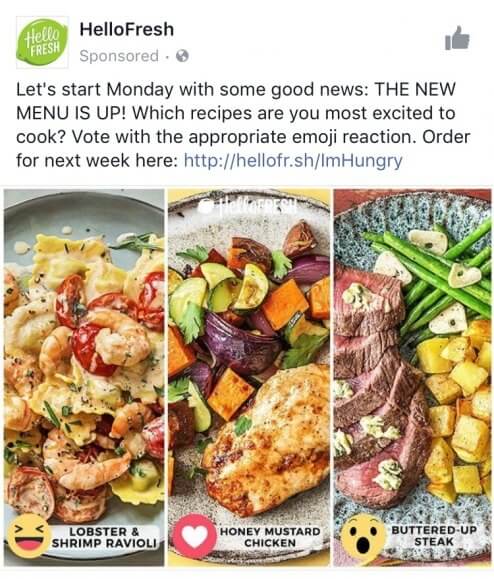
Actually it’s a post, then they promoted it. And this turns out to be among the best weight loss Facebook ads.
.
What I Love
1. Inviting User engagement
Shopify noticed 4x CTR on UGC Ads.
Adding up, Neil Patel found UGC Facebook Ad can bring 50% lesser cost-per-acquisition.
Leveraging a Proven-formula was a smart decision.
2. Perfect Capitalization
You see, “MENU IS UP!” is clear despite no para break.
This capitalization helps them: showing excitement and grabs attention.
And if you still didn’t get it…
I urge you to copy this ad word-by-word (it’s known as copy working), you’ll get that. 😉
3. Image stands out
How? Due to contrast.
Filled with joyful colors but complementing together, enough to grab your attention.
PRO Tip – you see the text naming the dishes, that’s called overlay effect and eminent for visibility.
Fortunately, Facebook has a tool. To know how to use it, read this.
4. Ad that not looks like an Ad
Prime reason it’s included in this collection. You see, they cleverly communicated – What’s inside the menu…
Tempting the audience with contrasting images
And like a normal post, tracked the audience engagement.
.
What could be better
None! I scratched my head for hours, but couldn’t find one. 😊
.
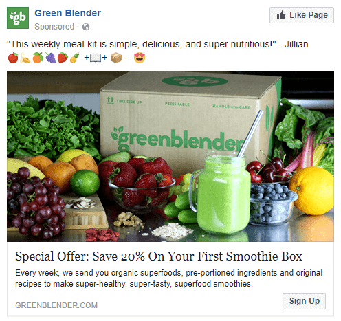
Green Blender
.
What I love
1. Less is more
As I said earlier, Good Ad copies have Less text yet conveys lots.
The use of emojis, eases to understand what’s in it for you.
Emojis of Fruits + Recipe Book + Box = Happy vibes
Bonus – Due to Colorful Emojis, makes their Ad stands out. Hence scroll test cleared.
2. Brand Logo in the image
This makes the brand identity and easier for the audience to recall your Ad. Hence, better re-targeted conversions.
And recall the Fb Ads funnel, discussed earlier, this Ad targets the 2 Level of the Type 2 Funnel.
3. Targeted for the first-timers
One-liner testimonial to entice the audience. And Exclusive discounts to first-timers, encourages them to buy.
And as I said, Ads targeted to a specific audience performs better.
.
What could be better
1. Classic Features VS Benefit mistake
Because of this I give Link Description = 2/10
You see it’s inclined towards describing the product solely, not sharing what problem it will solve.
Hence, lacking the USP.
It can be rewritten as:
‘Weekly, we send you organic superfood, pre-portioned, and easy-to-follow recipes to strike-out your boring cooking time. Delicious and Nutritious smoothies at your home.’
You got the picture, right! 🙂
.
Elizabeth Rider
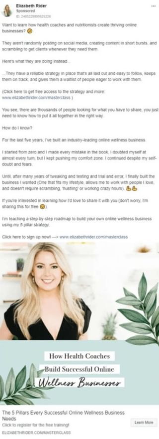
Fair suggestion – This time we’re reviewing Ad from a business owner, not from a multi-national brand. So, there would be few differences.
.
What I love
1. Introduced herself – Didn’t miss the trick
Read the line, “for the last five years…. crazy hours” (8th Para)
Like I said, people are aware of established brands but not with solopreneurs.
So, you gotta introduce yourself. Once they know you, then only they can trust you… not the reverse.

Brownie Points – Used Storytelling. Persuasive because it lets readers imagine themselves in the author’s shoes.
2. Hitting the nerve
Points the most common mistake, “They aren’t posting… they need them” (2nd Para)
This shows how meticulously observed people’s mistake. Sharing the most common ones. And crafted it in a nerve-wracking shape.
3. Used AIDA to hook the audience
Asked a question and calling out the audience to draw their attention
Showed Problems to make it relatable and interest the audience
Showed them what they can achieve to heat the latent desire
Then a CTA to drive the action towards the workshop
Bonus Points for using double CTA
If you too want to excel in writing AIDA, read how Neville Medhora writes.
.
What could be better
1. Inconsistent Copy
When you’re crafting an ad, better to keep the message consistent. You don’t want unnecessary doubts popping in the readers’ minds.
A) Disparity with the picture and Link Heading
Link Heading reads out online wellness while Picture says Health coaches.
“I always integrate my headline into the image because if Facebook users are gonna stop and look at the image first, the copy will get them to click. The headline in the image is usually the same message as the link headline”
By Gavin Helm Smith, Direct Advertising Copywriter.
B) Bad CTA choice
Her Ad text says… “sign up” while CTA in the picture says “Learn More”
Again, she needs to be consistent.
C) Inconsistent colloquial tone
Contractions help readers to skim content quicker. That’s the reason I use it in my blogs everytime.
Some places Elizabeth used it and some places omitted.
they have -> they’ve
there are -> there’re
I hope that cleared the air for you!
2. Weaker verbs at some places
Read this line, “thousands of people looking for… right way”
Replace people with leads. Remove ambiguity, makes the sentence stronger.
3. Tweaks needed in the hook
She penned, “Want to learn how health coaches and nutritionists… online?”
Better version, “Want to learn how 7-Figure Health Coaches & Nutritionists… online?”
Adding number evokes curiosity, simple copywriter’s trick. Capitalizing the correct letters would further help to draw attention.
.
Instant Knockout
This time, it’s a Carousel Ad!
Carousel Ads work best to introduce multiple offerings. Display best on both mobile and desktop. And marketer’s choice because carousel ads lower acquisition cost upto 50%.
.
What I love
1. Ads Timing
Ad Timing is inevitable for sales! Example, rarely people would buy winter clothes in July. But would swipe their cards for scarves in November.
Same story here!
The Ad was published in the New Year 2021.
New Year meaning New Resolutions. And do you know, exercising to stay fit is #1 resolution in the USA.
Simply, People are already looking for fitness solutions to turn their resolution into reality.
2. Killer Hook – To Execute
Re-start, Re-set, and Re-discover… speaking one thing, and it is… (any guesses?) RESOLUTION.
I love alliterations when done right. And Instant Knockout did it.
.
What could be better
1. Coming on sales quickly
The ad got your attention with 3-Re but what’s next?? You’ve piqued the interest, and expecting the guy to buy. Not-so-good idea!!
Fill the space with juicy benefits or testimonials or past numbers.
.
Conclusion
In this mini-copywriting swipe file we looked at what Psychologies marketers use while curating the Ad. Such it triggers the targeted audience to do the requisite.
We had a closer look on details they did best, and places which can be improved. Thereby, the best practices you can copy and pitfalls you can avoid.
Now, what do you think?
Do pass your thoughts (eager to listen them 👂🏻)
Or
Any weight loss or health-niche Ad you’ve wanna share…
Drop it on LinkedIn as Arpit Agarwal OR Instagram as Copywriterarpit.


)